Here is how I came up with the logo for my “Identiflora” project.
I know normally I would have some pencil sketches, but my idea was all vector fonts from the moment it entered my head, so I didn’t sketch any lines. Â IÂ imagined question marks rotated around a circle, looking like flower petals – since my project is about identifying flowers.
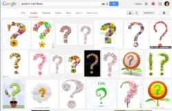
 The first thing I did was do a cursory Google search, and didn’t discover anyone else using anything like that idea. Â (Whew!)
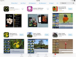
 Next I decided to check the iTunes App Store both to get an idea of what a good, clear logo would look like, and to see which logos are already out there.  I also consulted this article on How to Create Better App Icons.
 So with that in mind I started making my vector question marks. I began with a base font, and squashed it around a bit so it is “mine” and not a specific font.
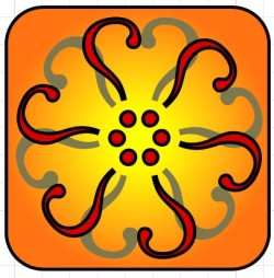
I like where this is going but, hey, those question marks are all backwards!
So I flipped them. I also decided this orange color is not reading “flower.” It looks more like “sun.”
I switched to green and red, like red rose petals. But it just wasn’t working for me. I tried some more colors and even added leaves to emphasize “flower.” But I don’t just want a flower, I want a question too. So I finally realized I should make the question mark stand out!
But that doesn’t read as a flower. It’s just a “weird octopus made of question marks”. So I went to my secret flower weapon: pink. This one is a keeper.
What do you think?


